La Maison Mathieu’s Colour Palette

It feels really odd putting together an entire blog about my house’s colour palette, but it has also occurred to me how many times I’ve seen pictures of someone else’s home or painted projects, only to struggle to find the actual name of the colours they used. So, in the hopes that my colour choices have appealed to at least one of you out there, I figure I should put all the paint colours I’ve used throughout my home (so far) down in one place.
Interior

Black by Behr
Kitchen table & chairs
Bed risers
In my opinion this is a true black, although (fun fact) it’s made without any black pigment at all. Go figure! Choosing a black is much like choosing a white — there are so many different options of the same thing it can sometimes be hard to spot the subtle variations in tones, base colours, and intensity. Be mindful that many different brands often use the same name for their colours but they are very much not the same. “Black” is about as generic a name for a colour as it gets, so if this is the colour of black you land on, you’ll want to specify that you want Behr Black.
(Side note, Behr also makes a colour called “Totally Black” which is different from “Black”, so you’ll also want to be mindful of the adjectives you use to describe your colour when ordering from the paint desk)

I refinished this table and the cane back chairs in “Black” by Behr.

Chantilly Lace by Benjamin Moore
Walls throughout house
Fireplace
Walls & trim in gym
The best and most neutral white out there, in my humble opinion. It goes anywhere and everywhere. I’m a die-hard Chantilly Lace fan!

My living room and fireplace painted in “Chantilly Lace” by Benjamin Moore.

Thousand Islands by Benjamin Moore
Wall trim in main living space
Interior doors in main living space
I’ll admit that I loved the paint swatch a little more than the actual colour in person at first (those darn swatches aren’t always true to colour) but it has genuinely grown on me. This colour is a real chameleon and is easily swayed by the warmth of ambient light. Warm lights will bring out peachy tones, while cool lights sometimes enhance the yellows.

All of the interior doors and trim have been painted with “Thousand Island” by Benjamin Moore.

Teal Mosaic by Behr
*The colour I originally used is called Totally Teal by Behr but it appears to be discontinued, so I’ve added Teal Mosaic by Behr as the closest alternative
Kitchen cabinets
Ok, so this colour was not my first choice for our kitchen cabinets but my husband loved it, so I thought “what the hay”? and went for it. It was one of the first “colours” we introduced into this home and has steadily influenced my design choices ever since.

The kitchen cabinets were painted with “Totally Teal” by Behr.

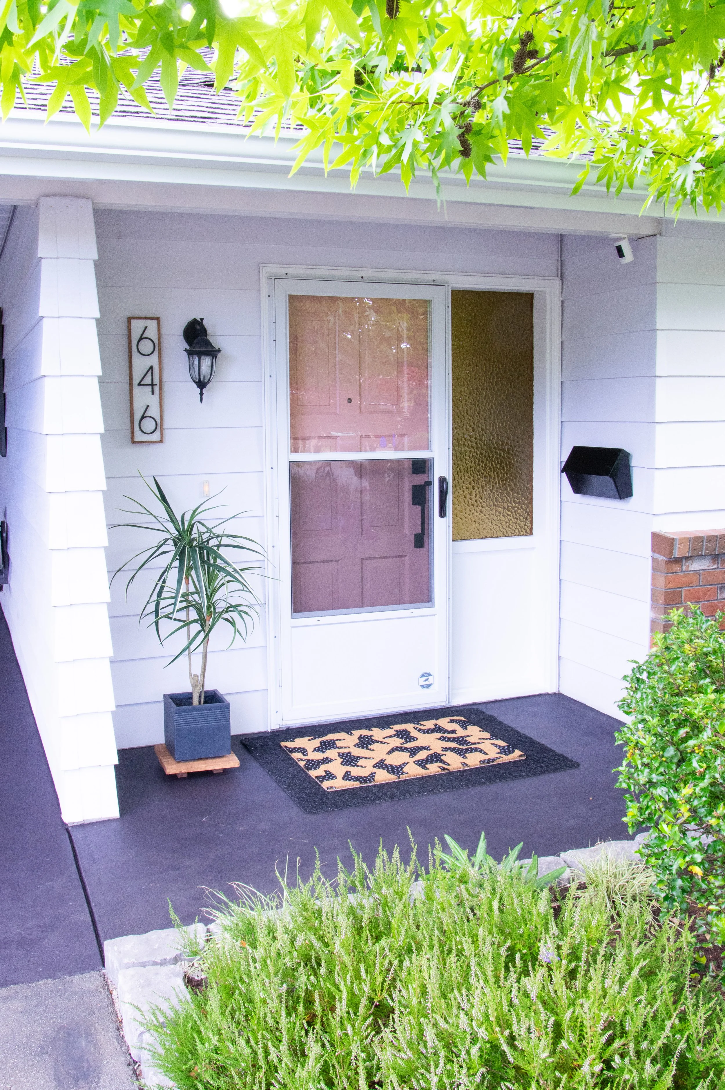
Peaches n Cream by Benjamin Moore
Exterior doors
Main bathroom vanity
Interestingly, this was also not my first choice for our main bathroom vanity, although it was taped up among the countless other swatches. My daughter pointed this one out and the more I sat with it, the more the entire design of the bathroom made sense. This colour officially cemented my design direction with our house into the quirky Art Deco meets mid-century vibes.

My pink front door - painted with “Peaches and Cream” by Benjamin Moore.

Spiced Rum by Benjamin Moore
Laundry room
I chose this colour because I wanted to push myself out of my comfort zone. This house is so much more colourful than it would be if I was the only one living here, for real! I like neutrals (white, black, beige) with lots of textures. Brown was never really a colour I had considered. But leaning into the mid-century aesthetic, I felt like this colour would give the laundry room a funky little personality in a slightly neutral way.

In my laundry room I used “Spiced Rum” and “Chantilly Lace”, both by Benjamin Moore, to achieve this colour block effect.

Kept Love Letters by Benjamin Moore
Daughter’s room, walls & trim
My daughter chose this colour from a couple other swatches I had given her as options and I’m glad she did. It’s such a pretty pink (if you’re going for all over the walls kind of pink) with a subtle mauve-y hue.

“Kept Love Letters” by Behr is a perfect muted pink for a kid’s room.

Berry Fizz by Benjamin Moore
Daugther’s room, doors
I knew I wanted to add a playful contrasting colour to her room when I refinished her closet so I chose a tonal contrast with this vibrant pink. I chose it to play into the blue tones that were coming out of the main wall & trim colour, Kept Love Letters.

“Berry Fizz” by Benjamin Moore adds some energy to these closet doors.

Baked Clay by Benjamin Moore
Hallway mural
In truth, the hallway mural is made up of colours I have just loved and haven’t found anywhere to put them yet.

Santa Rosa by Benjamin Moore
Hallway mural
I simply love this colour. I must find more places to paint it.

Yellow Marigold by Benjamin Moore
Hallway mural
A very true golden yellow. It’s happiness.

Parisian Patina by Sherwin Williams
Hallway mural
This is the colour I would have painted our kitchen cabinets had I not been trying to be a good wife and include my husband’s input from time to time. It’s such a cool colour!

Farm Fresh by Benjamin Moore
Hallway mural
If you’re looking for a warm beiges-brown, this is it! Lovely.

This geometric colour block hallway mural was my attempt at adding some quirky personality to what was previously a pretty neutral space.
Exterior

Distant Grey by Benjamin Moore
Exterior door trim
This is a bright neutral white with a slight blue-grey hue. But don’t let the “grey” in the name mislead you. It is most definitely white. I chose it because our house’s siding was already painted in a cool white and they play well together.
“Distant Grey” by Benjamin Moore is as crisp a white as you can find in outdoor settings.

Slate by Behr (Waterproofing Solid Colour Stain formula)
Privacy fences
Gym eaves & soffits
Honestly, this colour reads much more black than grey (as the name “Slate” would imply). It not that dissimilar to Behr Black that I used on my indoor projects, in my opinion.

“Slate” in solid colour waterproofing stain by Behr is the perfect black for outdoor fence and trim projects.

Shiitake by Sherwin Williams
Patio
When I was deciding on the interior doors and trim colour, I went back and forth between Shiitake and Thousand Islands for longer than I’d care to admit. I finally chose Thousand Islands for the interior but I knew I would find a use for Shiitake somewhere else. When the patio project came up, I opted for Shiitake over Thousands Islands because it is slightly more neutral and doesn’t seem to colour-shift quite as much with the ambient light.

Swiss Coffee by Benjamin Moore
Patio
This creamy white is gorgeous! Honestly, I didn’t think I’d ever love another white as much as I love Chantilly Lace, but here we are. If you want a dreamy, creamy white look no further than Swiss Coffee by Benjamin Moore. As stated above, if you are colour matching in other brands, be mindful that some brands use the same name for similar but different colours. In this case, Behr also carries a Swiss Coffee but it is very different from Benjamin Moore’s version.

The painted patio of my dreams came to be with “Shiitake” by Sherwin Williams and “Swiss Coffee” by Benjamin Moore.